Academic project · Mobile design · 8 min read
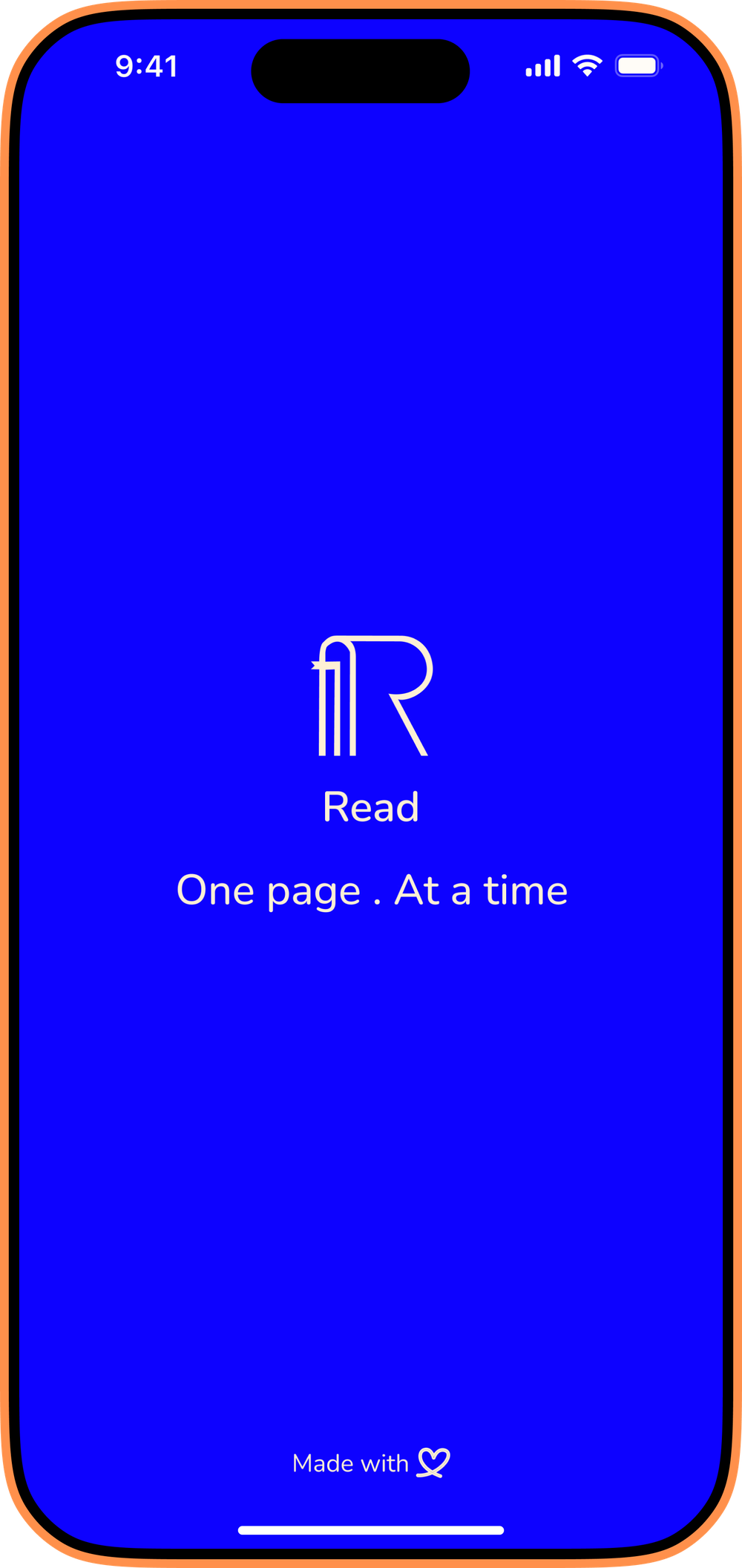
Read: One page. At a time.
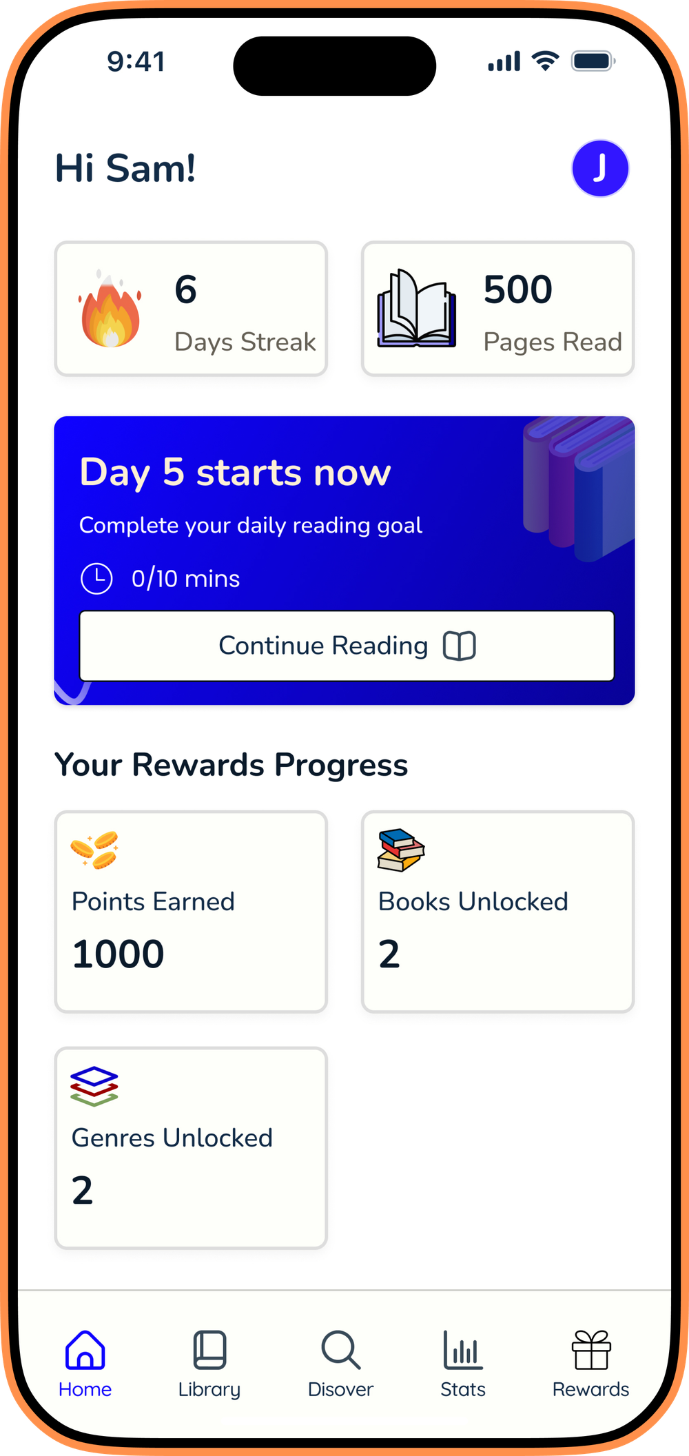
A habit-forming reading app for first-time readers, designed around small daily goals, visible progress, and earned rewards.
Role
End-to-end UX
Timeline
16 weeks
Type
Academic project
Tools
Figma · Miro · Lovable
The gap
The data shows a quiet crisis of unread books.
The solution
Don’t sell them books. Help them become readers.
Three core experiences across the daily reading loop: each making progress visible at a different scale.
Set today
How long today?
Daily target from 1 min to 60. Calibrated to the user's pace.
Session complete
Nice work today.
Invisible progress made visible: minutes, pace, pages.
You earned
A new badge.
Streaks, badges, and curated rewards compound over time.
Design strategy
Designing for habit formation, not consumption.
Trigger
What brings them back
Internal: the pull of an unfinished book. External: timed pushes and home-screen widgets.
Action
The simplest behavior
Open the app, hit start, read. One button press to a daily session.
Variable reward
Fulfilling, never the same
Stats, streak status, an occasional gift card or new badge: different feedback each time.
Investment
Why the next session is richer
Streaks accumulate. Stats build a profile. Monthly summaries show the reader being formed.
Usability findings
What testing surfaced that research alone wouldn’t have.
From the usability study
“I went to rewards to see if there were different ways to go for my rewards… that opened to Settings.”
Participant · Usability study
5-participant moderated study, April 2026
Iteration 01 · Modify
The reading timer wasn't doing its job.
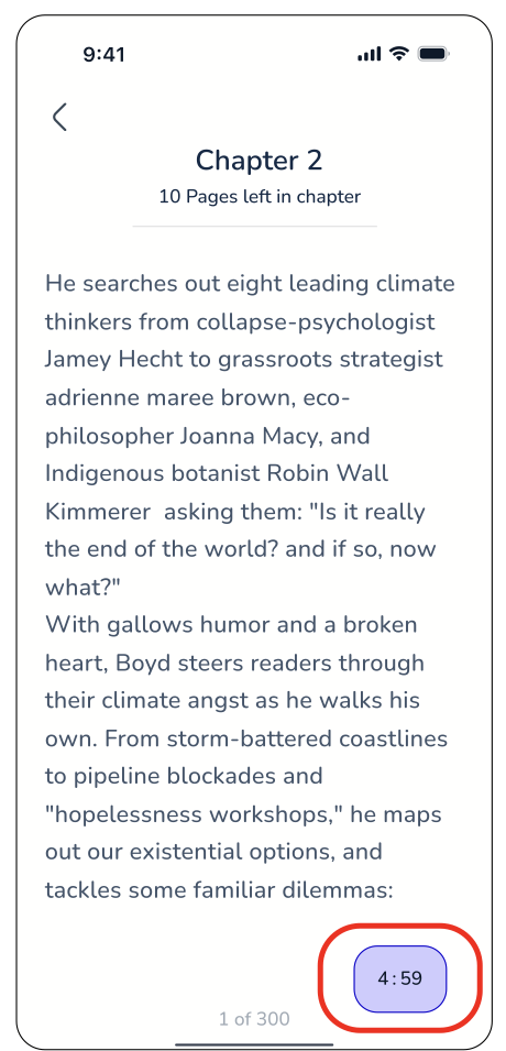
The timer is the clearest live signal that a session is being tracked, but it sat small and bottom-anchored. Participants didn't notice it mid-session and didn't trust their progress was being recorded.
Before
After
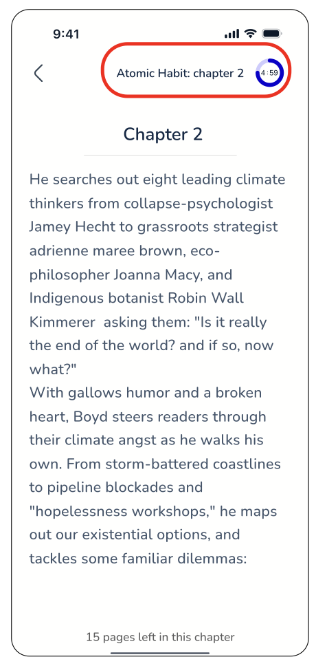
What changed: Moved the timer to the top of the reading screen, paired it with the book title and chapter, and wrapped it in a progress ring so the in-progress state is impossible to miss.
Iteration 02 · Adapt
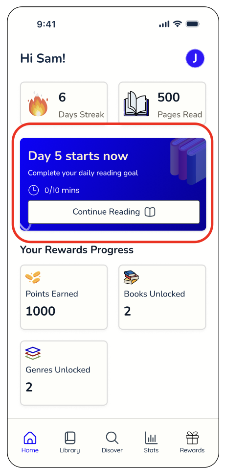
The home screen didn't say what you were reading.
The hero card on Home is the first thing every visit shows, but it only displayed the daily goal, not which book was in progress. Participants said this would confuse them if they were reading more than one book at a time.
Before
After
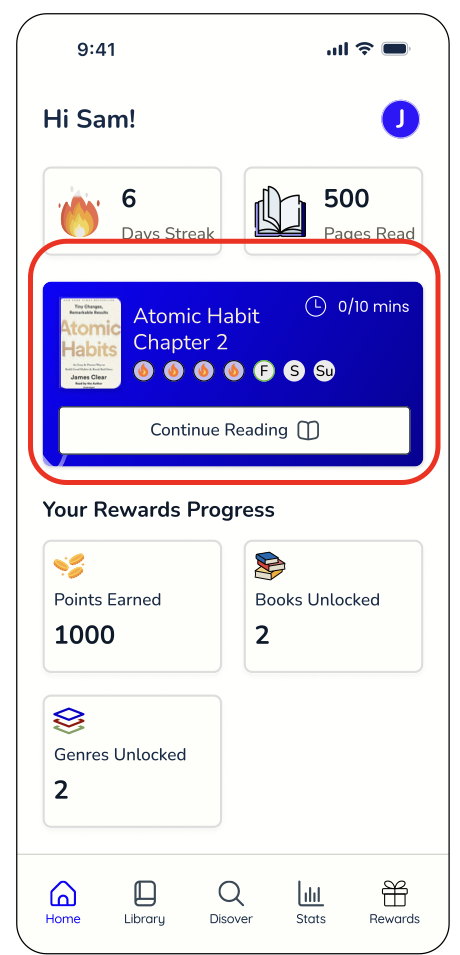
What changed: Rebuilt the hero card to lead with the book itself: cover, title, chapter, and a day-by-day streak strip, alongside the daily goal.
Iteration 03 · Combine
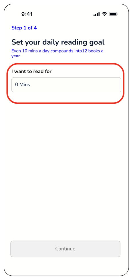
Setting a daily goal meant typing a number into an empty field.
Onboarding asked people to set a reading goal with no guidance on what a reasonable number even was: every participant had to guess.
Before
After
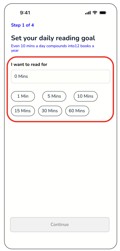
What changed: Combined preset pills (1–60 minutes) with the free-text field, so most people tap once while anyone with a different routine can still type their own value.
Iteration 04 · Substitute
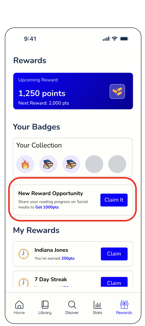
“Claim It” promised a prize and delivered a share sheet.
The rewards screen's top CTA read “Claim It,” but tapping it opened a social-share flow, not a reward. Participants expected points, not a prompt to post.
Before
After
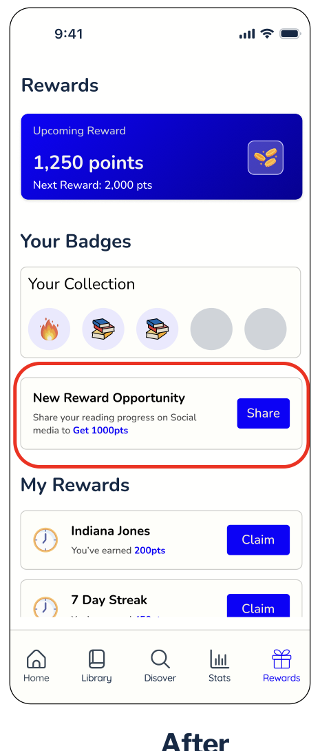
What changed: Renamed the CTA to “Share” and surfaced the points-for-sharing value inline, so the label matches exactly what happens next.
Usability testing
Validated with real readers, not assumptions.
5 moderated sessions over 2 weeks, run over Zoom against a Figma prototype. Tasks were structured around the Hook Model (Trigger, Action, Variable Reward, Investment), so testing covered the full habit loop, not just individual screens.
5
Participants
76%
Task success rate
85%
Avg. confidence & ease
10
Core tasks
60
Net Promoter Score
28
Issues found & triaged by severity
Biggest learning
The most damaging issues weren’t structural: they were one-word labels that mismatched what people expected. Words ship cheaper than rebuilds.